Detailed Design
UI Design
The UI design of Poolerz.
Our application consists of three primary sections: Carpools, Profile, and Dashboard. These sections offer key functionalities such as joining, creating, and optimizing carpools, as well as viewing event calendars. Below is a detailed breakdown of selected screens and design reasoning behind them. The focus of these interfaces is on joining or creating a carpool and the ability to view and optimize carpool groups.
 The Carpooling Home Page is the core screen, allowing users to:
 The Create Carpool Page allows users to input details for creating a new carpool organization. This page includes fields for:
 The Carpool Information Page is where users and administrators can view and manage carpool data. Key features include:
Summary:
The UI design follows Nielsen’s Usability Heuristics to create a user-friendly, efficient, and intuitive experience across the application. From a clean, minimalist layout to structured user flows and error prevention, each screen aims to enhance user satisfaction and engagement. The consistency and clarity in design ensure users can easily navigate through creating, joining, and managing carpools with ease.
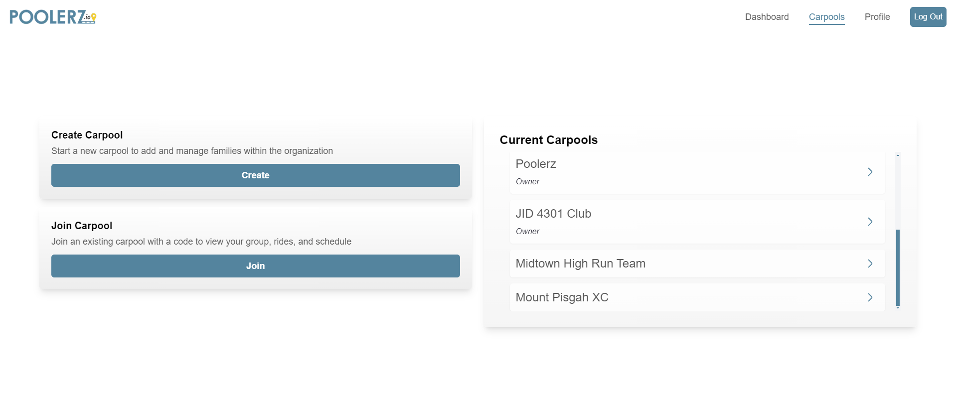
Figure 4.1 - Carpooling Home Page
The Carpooling Home Page is the core screen, allowing users to:
- Create a new carpool
- Join an existing carpool
- View all current carpools
Design Features:
Usability Heuristics:
-
Aesthetic and Minimalist Design:
- Clean layout with essential options for a clutter-free experience.
- Brand colors (blue and yellow) create a clear visual hierarchy, enhancing readability.
- White space and tabs balance the design without extraneous elements.
-
Match Between System and Real World:
- Simple terminology like “Create Carpool”, “Join Carpool”, and “Current Carpools” mirrors real-world language, making it intuitive.
- Navigation arrows mimic common patterns used in other apps, signaling clickable elements.
-
Consistency and Standards:
- Uniform design of buttons and text styles across the app, ensuring consistent user expectations.
- Navigation menu placement follows common web app conventions.
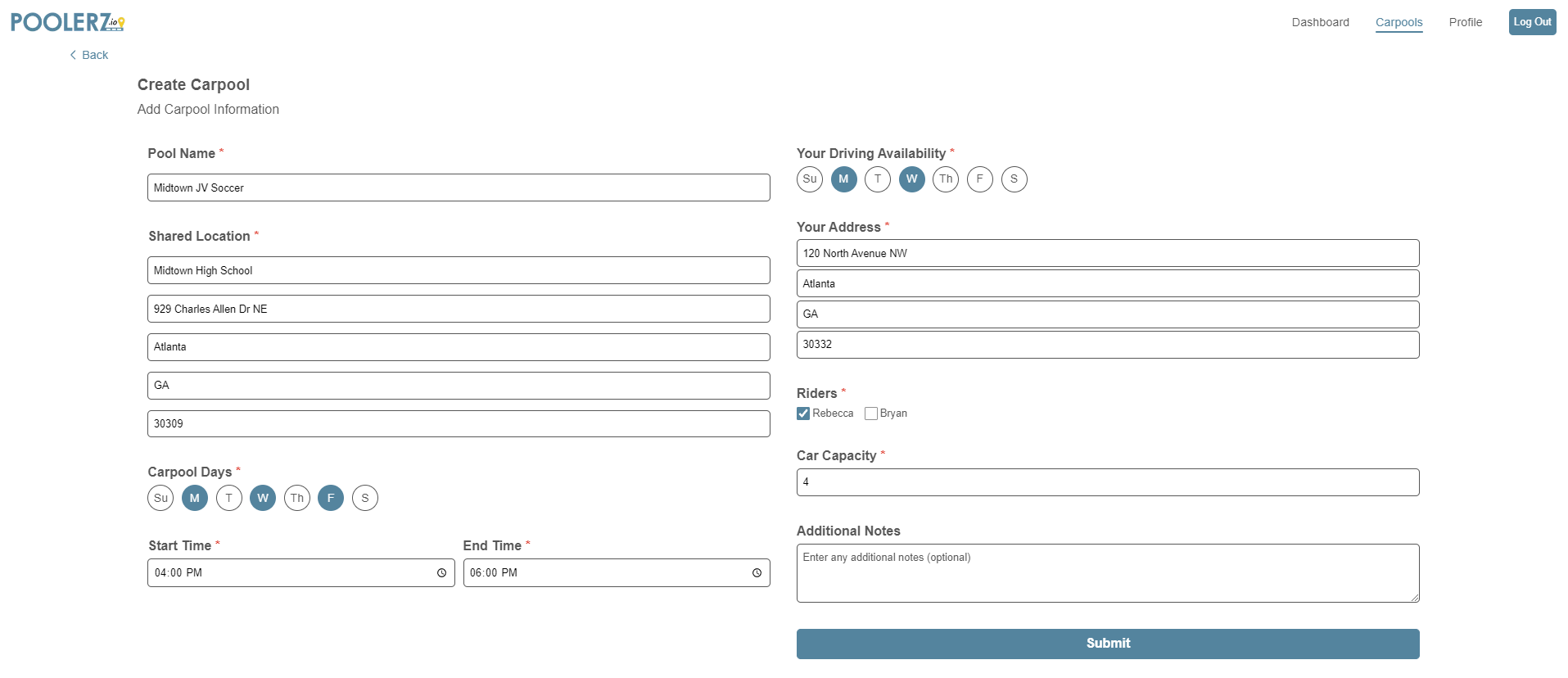
Figure 4.2 - Create Carpool Page
The Create Carpool Page allows users to input details for creating a new carpool organization. This page includes fields for:
- Carpool name, address, time, etc.
- Personal information such as driving availability, car capacity, and any notes for other members.
Design Features:
Usability Heuristics:
-
Error Prevention:
- Required fields are marked with red asterisks to guide users.
- Disabled “Continue” button until required fields are filled to prevent incomplete submissions.
- Logical grouping of inputs to minimize errors.
-
User Control and Freedom:
- Editable fields allow users to adjust details before submission.
- Toggle selections for days, riders, and availability make corrections quick and easy.
- Back button offers an escape without committing to changes, with a confirmation modal for added security.
-
Visibility of System Status:
- Progress indicators like location, schedule, and car capacity help users track their setup.
- Highlighted selected days and availability provide visual confirmation of choices.
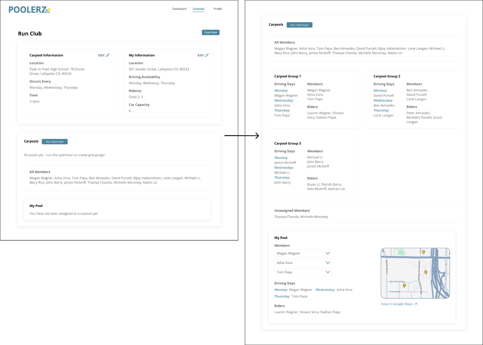
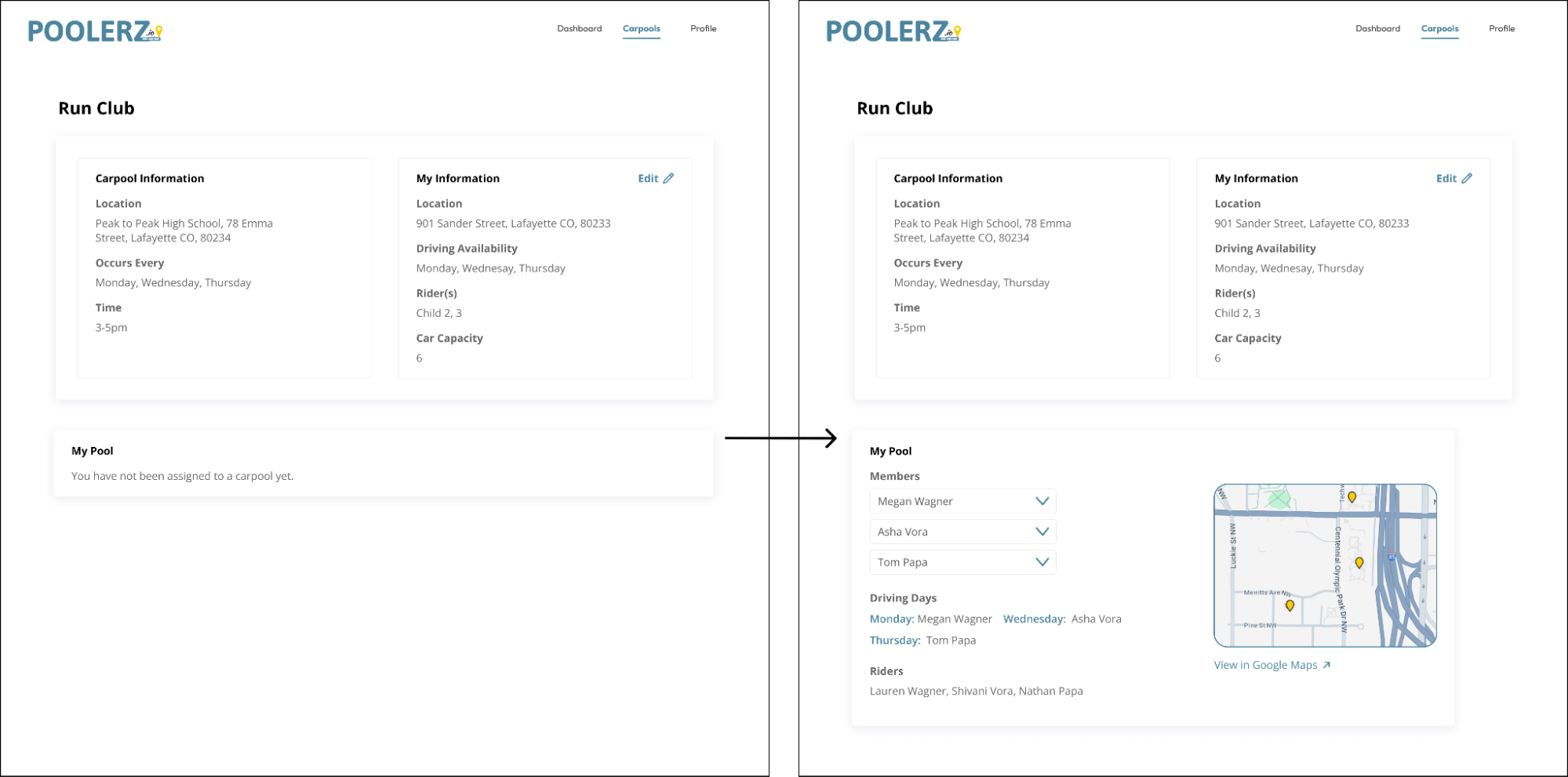
Figure 4.3 - Carpool Information Page
The Carpool Information Page is where users and administrators can view and manage carpool data. Key features include:
- Viewing carpool and personal information
- For admins, the ability to run the optimizer to group members into carpools.
Design Features:
Usability Heuristics:
-
Visibility of System Status:
- Clear messaging about carpool assignments, showing when no groups are assigned and updates once the optimizer is run.
- “Run Optimizer” button guides admins on next steps, improving clarity and flow.
-
Flexibility and Efficiency of Use:
- Efficient layout allows quick access to relevant info without unnecessary steps.
- Admins can edit carpool and personal details, while the optimizer automates grouping, making the process faster and more flexible.
-
Recognition Rather than Recall:
- Clear display of information like assigned groups, driving days, and member statuses.
- Divided sections (e.g., “Organization Information”, “My Information”, “My Pool”) help users find details without recalling specifics.
Summary:
The UI design follows Nielsen’s Usability Heuristics to create a user-friendly, efficient, and intuitive experience across the application. From a clean, minimalist layout to structured user flows and error prevention, each screen aims to enhance user satisfaction and engagement. The consistency and clarity in design ensure users can easily navigate through creating, joining, and managing carpools with ease.